
Websites
-

Virtual Prep Campaign
READ MORE: Virtual Prep CampaignMulti-State Charter SchoolCampaign Network Integrated digital and traditional campaigns across 10+ states, from Washington to Florida,…
-
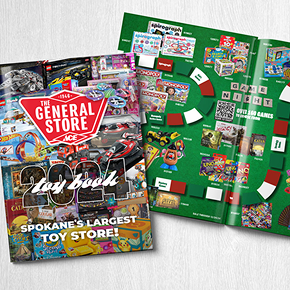
General Store
READ MORE: General StoreHow We Doubled Online Orders foran 80-Year-Old Hardware Store Complete e-commerce transformation for Spokane’s trusted hardware…
-

Kalispel Casino
READ MORE: Kalispel CasinoModern Casino WebsiteBuilt for Every Device Mobile-first design and intuitive content management for one of the…
-

The Williams Group
READ MORE: The Williams GroupSophisticated Brand Identity& Website to Match Complete brand development and custom website for wealth management firm…
-
Virtual Prep
READ MORE: Virtual PrepScalable Brand System forMulti-State Charter Network Complete brand architecture and WordPress Multisite network supporting educational expansion…
-
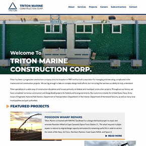
Triton Marine Construction
READ MORE: Triton Marine ConstructionModern Website forMarine Construction Leader Complete site redesign modernizing digital presence for federal and municipal construction…
-
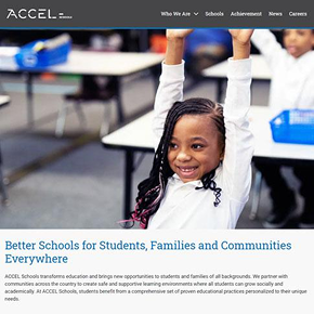
Accel Schools
READ MORE: Accel SchoolsCorporate Website for50+ School Network Sophisticated school search platform and modern website for leading education provider…
-
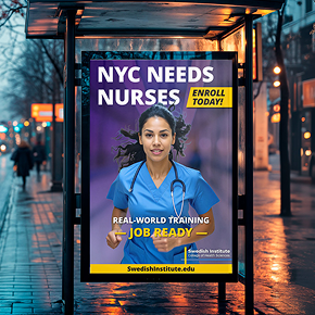
Swedish Institute
READ MORE: Swedish InstituteSwedish Institute Website Redesign Project KELLYBRADY has supported Swedish Institute of Healthcare Science’s web development, marketing,…
-

Chaffin Dental Care
READ MORE: Chaffin Dental CareChaffin Dental Care Web Project For over 20 years Chaffin Dental Care has been providing general…
-
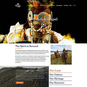
Kalispel Tribe of Indians
READ MORE: Kalispel Tribe of IndiansWebsite Design & Development for Kalispel Tribe of Indians The Kalispel Tribe of Indians approached us…